Landing Page
By default, your organization’s home page lists your courses and other content. The landing page builder lets you replace it with your own page, made of sections you stack and style: a hero, course lists, testimonials, pricing, an FAQ and more.
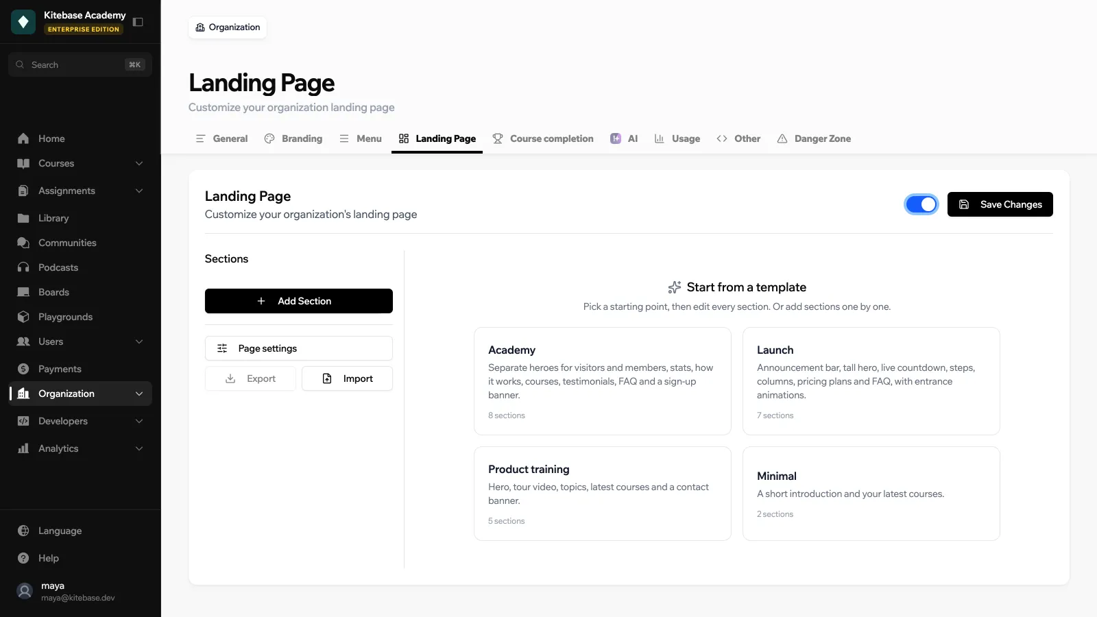
Go to Organization → Landing Page and turn on the switch at the top. While it is off, visitors see the default home page. Your sections are kept either way.
Starting points
- Start from a template: Academy, Launch, Product training or Minimal. A template fills the page with example sections you then edit.
- Import: load a page from a JSON file (1 to 60 sections). Imported pages are not live until you save.
- Export: download the current page as a JSON file you can import again later.
Page settings
Page settings apply to the whole page: the background, the Content width (Normal or Wide) and the Gap between sections (none, small or medium).
Sections
Click Add Section and pick a type:
| Section | Description |
|---|---|
| Hero | A heading, subheading and buttons, with an optional illustration, background and dark overlay. Height can go up to full screen. |
| Text & Image | Text and an image side by side, with buttons |
| Logos | A row of logos, such as partners or clients |
| People | Team members with name, description and photo |
| Courses | Courses you pick, or your latest courses (you set how many) |
| Video | Embed a YouTube, Vimeo or Loom video, or upload your own |
| Text | A heading and formatted text, written in Markdown |
| Features | A grid of 2 to 4 columns of cards with an emoji icon, a title and a description |
| Stats | Big numbers with a label, like learners or courses |
| Testimonials | Quotes with name, role or company and photo |
| FAQ | Questions that expand to show their answer |
| Call to action | A bold banner with a heading and buttons |
| Gallery | A grid of 2 to 4 columns of images |
| Spacer | Empty space, with an optional dividing line |
| Pricing | Plan cards with a price, a feature list and a button. A card can be linked to a store product so its price and checkout link stay in sync with your offers. |
| Steps | A numbered sequence, side by side or stacked |
| Columns | Two to four columns of Markdown text |
| Image | A single large image with an optional caption and link |
| Embed | A form, calendar, map or board from a supported service: Calendly, Typeform, Tally, Airtable, Google Docs, Forms and Maps, Figma, Loom, Canva, Miro, YouTube or Vimeo |
| Announcement | A slim bar for news or promotions, with an optional link |
| Countdown | A live timer to a launch or deadline, with text to show once it is over |
Options on every section
| Option | Choices |
|---|---|
| Visibility | Everyone, Signed-in users only or Signed-out visitors only |
| Hide this section | Keep it in the editor without showing it |
| Devices | All devices, Desktop only or Mobile only |
| Show from / Show until | A date and time window, handy for launches and promotions |
| Styling | Background (none, solid color, gradient or image), Text color, Vertical spacing, Width (Normal or Narrow), Title alignment, an Anchor to link to the section, and an Entrance animation (none, fade in or slide up) |
Save to publish your changes.
Visibility rules make it easy to show a sign-up pitch to visitors and a “continue learning” section to members on the same page.
